| View previous topic :: View next topic |
| Author |
Message |
slickx
Joined: 15 Sep 2011
Posts: 9
Location: Romania
|
 Posted: Sat Sep 17, 2011 8:07 pm Post subject: SlickX suggestions and stuff Posted: Sat Sep 17, 2011 8:07 pm Post subject: SlickX suggestions and stuff |
 |
|

This post is about me making random things to improve the interface and the features of this cool 3d program |
|
| Back to top |
|
 |
slickx
Joined: 15 Sep 2011
Posts: 9
Location: Romania
|
 Posted: Sat Sep 17, 2011 8:24 pm Post subject: Posted: Sat Sep 17, 2011 8:24 pm Post subject: |
 |
|

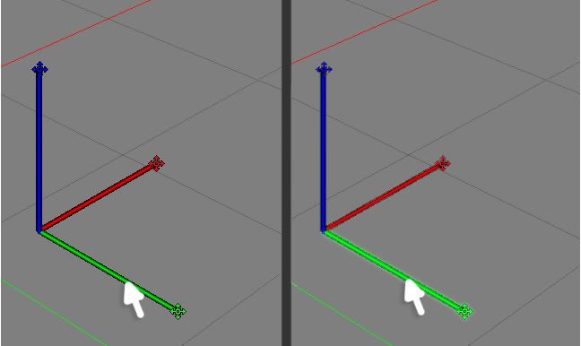
The handles are very hard to use because the mouse can only interact with the tips of the handle where the "move,rotate,scale" icons are placed.
now two ways for solving this problem:
1) as shown in the picture above, make the axes highlight when the mouse is almost near them and on them not only on the tip of the handle.
and make them functional along the length of the handle not only on the tip.
2) loose the markers on the handles since it make it look hard to use in the first place.just simple handles that show arrows.
Now in select mode the axes can be moved.ex: select 2 points and by dragging one handle it moves the points,in move mode it should do the same.
on rotating mode the axes should change to that sphere kind of handles and no arrow handles.
hope i made myself clear hehe .thanx |
|
| Back to top |
|
 |
slickx
Joined: 15 Sep 2011
Posts: 9
Location: Romania
|
 Posted: Sat Sep 17, 2011 11:30 pm Post subject: Posted: Sat Sep 17, 2011 11:30 pm Post subject: |
 |
|
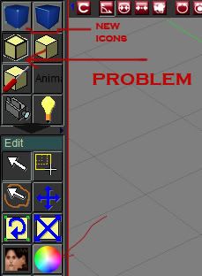
Bigger icons will be better,easier to understand what is the meaning of the icon.
All the primitives should be grouped under one icon and after you click on the button a list will appear with all the primitives.
The "CUT TOOL" to be the same for all the 3 modes: edge,face,points.
Cut tool modes: loop,plane
also in the cut tool would be nice to implement a a little checker box to toggle on and off "cut only visible " witch means even if i use the standard cut tool i still can get the whole object sectioned.
Need a way to adjust the viewport rotation sensitivity or make it be half as it is now by default.
Need the mouse to detect the edges,points and faces when in their proximity and highlight them and so selecting them could be easier. |
|
| Back to top |
|
 |
craouette
Site Admin
Joined: 26 Apr 2004
Posts: 652
Location: luxembourg
|
 Posted: Sun Sep 18, 2011 4:23 pm Post subject: Posted: Sun Sep 18, 2011 4:23 pm Post subject: |
 |
|
Hello,
I like the picture!
for the moving the point of view manipulator, Ok, i understand and will do. But I won't spend too much time on them, as they are not used a lot... mouse + shortkey is the way to go.
| Quote: |
Now in select mode the axes can be moved.ex: select 2 points and by dragging one handle it moves the points,in move mode it should do the same.
on rotating mode the axes should change to that sphere kind of handles and no arrow handles.
|
yes and no... there is the mix mode, where move, rotate, scale are available.
and displaying the move axis and the rotation is possible (go to the options->preferences) but kind of get in the way, hiding the thing the user is working on!
May be a picture would help me to understand...
| Quote: |
Need a way to adjust the viewport rotation sensitivity or make it be half as it is now by default.
Need the mouse to detect the edges,points and faces when in their proximity and highlight them and so selecting them could be easier.
|
ok, will add a sensitivity parameter.
for the hightlight, this is a good idea, but the mouse pointer is already doing that: changing when a selection is possible. Isn't it a little bit too much to have both? |
|
| Back to top |
|
 |
craouette
Site Admin
Joined: 26 Apr 2004
Posts: 652
Location: luxembourg
|
 Posted: Sun Sep 18, 2011 4:32 pm Post subject: Posted: Sun Sep 18, 2011 4:32 pm Post subject: |
 |
|
I forgot, did you try to set bigger icons?
I think their size is not set by the program, at least for the main bar, not so sure for the view bar!
It is always difficult to find balance between good looking meaningful icons and no taking too much on the working space! |
|
| Back to top |
|
 |
slickx
Joined: 15 Sep 2011
Posts: 9
Location: Romania
|
 Posted: Sun Sep 18, 2011 5:17 pm Post subject: Posted: Sun Sep 18, 2011 5:17 pm Post subject: |
 |
|
I find the Cinema 4d has the one of the friendliest user interface and ill probably end up making a video and share the features i like about that program.
Its hard to explain since english is not my first language.
some icons are set to a size and if i make them bigger they will just overlap other things,the interface does not adjust after their size. I will make list about icons used in two different 3d modeling programs : Cinema 4d and AC3d.
I hope im not annoying you with the Cinema 4d "stuff" but in my opinion it has some cool features and simple design.
Thanx for the feedback. |
|
| Back to top |
|
 |
craouette
Site Admin
Joined: 26 Apr 2004
Posts: 652
Location: luxembourg
|
 Posted: Sun Sep 18, 2011 5:36 pm Post subject: Posted: Sun Sep 18, 2011 5:36 pm Post subject: |
 |
|
Yes, I checked, you are right about the icons... will change that!
You are not annoying me at all... but I don't want to be copying another software!! so, It is a good idea to take it as a basis, but please, try to go further with fresh ideas on what is not working and why, what can be enhanced and how... |
|
| Back to top |
|
 |
slickx
Joined: 15 Sep 2011
Posts: 9
Location: Romania
|
 Posted: Sun Sep 18, 2011 7:09 pm Post subject: Posted: Sun Sep 18, 2011 7:09 pm Post subject: |
 |
|
ill take my time to learn the program since its..kind of complex. About copying the software its no worries in there.I make my own icons,3d models etc etc so im not trying to copy the software just some setups. Ex: 3ds max,cinema 4d all uses the same type of handles so its kind of a standard thing after all.
This week ill concentrate more on interface and how we could simplify it and make it more user friendly . |
|
| Back to top |
|
 |
slickx
Joined: 15 Sep 2011
Posts: 9
Location: Romania
|
 Posted: Sun Sep 18, 2011 7:36 pm Post subject: Posted: Sun Sep 18, 2011 7:36 pm Post subject: |
 |
|
| ahh i forgot.I made that picture special for the loading screen(its the same size u use for that loading screen picture).if you want it just save it to your computer and implement it to the program.cheers |
|
| Back to top |
|
 |
slickx
Joined: 15 Sep 2011
Posts: 9
Location: Romania
|
 Posted: Mon Sep 19, 2011 9:48 am Post subject: Posted: Mon Sep 19, 2011 9:48 am Post subject: |
 |
|
The icons problem can be solved quite easy using .png format since png is exported with a transparent layer by default.
Now if Albatross 3d can import .png and use its transparent layer properties we could make a big progress.
I made a few icons but if i try to make them transparent with the tool provided the edges of the icons are not that nice.
 |
|
| Back to top |
|
 |
craouette
Site Admin
Joined: 26 Apr 2004
Posts: 652
Location: luxembourg
|
 Posted: Mon Sep 19, 2011 11:45 am Post subject: Posted: Mon Sep 19, 2011 11:45 am Post subject: |
 |
|
A3D is not using the transparent color of the png (or tga) files...
but every icon is coming with a transparent color setting. a fix color (I usually use mid-gray, but any color will do) that will be the transparent color when displayed... |
|
| Back to top |
|
 |
slickx
Joined: 15 Sep 2011
Posts: 9
Location: Romania
|
 Posted: Mon Sep 19, 2011 8:32 pm Post subject: Posted: Mon Sep 19, 2011 8:32 pm Post subject: |
 |
|
| i know but between that gray and the actual icon ,after resize there will be some pixels that blend between that icon and gray.i discover more and learn about A3d and i like it alot. |
|
| Back to top |
|
 |
craouette
Site Admin
Joined: 26 Apr 2004
Posts: 652
Location: luxembourg
|
 Posted: Mon Sep 19, 2011 9:35 pm Post subject: Posted: Mon Sep 19, 2011 9:35 pm Post subject: |
 |
|
yes, that's normal... the color is slightly (mixed with pixel around) transformed!
not much can be done automatically... |
|
| Back to top |
|
 |
|
 Forum
Forum